


April 2025
Dear Reader,
One of the most common questions we get from both research and marketing professionals is, “What sample size is needed for the research I want to do?” The answer always depends on the type of study, the objectives of the study, the audience to whom it will be presented, and of course budget. We can make legitimate statistical calculations based on any sample size, but there are dramatic trade-offs in precision and cost no matter what sample size is chosen.
This newsletter features our interactive graph for choosing sample size built by Versta Research. It illustrates how margin of error changes as sample size changes. It will give you, your team, and your internal clients a more intuitive grasp of why very small samples can be risky and very large samples can be wasteful.
Other items of interest in this newsletter include:
- How long should a survey be?
- Five research design tips
- One lousy question can cause massive measurement error
- Two secrets of writing great research reports
- Here’s why silly surveys are actually dangerous
- Conflicting surveys give you insight
- Research should focus on your customers, not on your products
- When to kick out a survey respondent
We are also delighted to share with you recent publications based on our work and news stories and media coverage of Versta Research’s recent work including coverage for the Wells Fargo Money Study on CNN and USA Today.
Remember: you can do research with just ten people, or with ten million people. What difference will it make? About ± 31 percentage points. Please read on.
Happy Spring,
The Versta Team
An Interactive Graph for Choosing Sample Size
Research has consistently shown that a large majority of Americans (upwards of two thirds) do not believe that a sample of 2,000 people can accurately reflect the views of the nation’s population This is mind boggling. It is easy to prove that statistical sampling works, and there are volumes of evidence in our daily lives that it works. Still, most Americans do not believe it.
In some ways, though, it makes sense that they do not believe it. A sample of 2,000 Americans is just one one-thousandth of 1% (.00001) of the full U.S. population. How can this small number possibly predict how everyone feels? In our view, big questions about whether sampling works—and smaller questions about the right sample size for specific research—will likely never go away because even though mathematical proofs and confirming evidence are there, the math and the numbers behind these questions can be quite mind boggling.
Here’s a nice chart showing the maximum margin of error you will get for sample sizes ranging from 1 to 9,999 based on a 95% confidence interval:
Sample Size
Maximum Margin of Error
There is not much to be gained by increasing the sample size beyond ten thousand, going further to the right. But wouldn’t it be nice to actually show how little we decrease the margin of error by interviewing ten thousand people, 10 million people, or all 310 million Americans?
Turns out, that is nearly impossible to show. The numbers needed for effective sampling are miniscule compared to the numbers of people they ultimately represent. If your monitor is displaying this chart 5 inches wide, the chart would have to extend more than two miles to the right to reach 310 million. It would take you a brisk 40 minute walk to read the whole chart. To show a sample size of 10 million people (a mere 3% of the U.S. population) we would have to extend the chart more than the length of a football field. We thought it would be cool and educational to show you the whole chart. But the mind boggling size of the numbers gets in the way.
What if we adjust the scale, so that all 310 million fit on the chart? The problem then is that the chart shows nothing. It is a vertical line on the left, a flat line along the bottom and not much else, because all the action where sample size makes a difference happens in a tiny slice of the chart that is invisible to the naked eye:
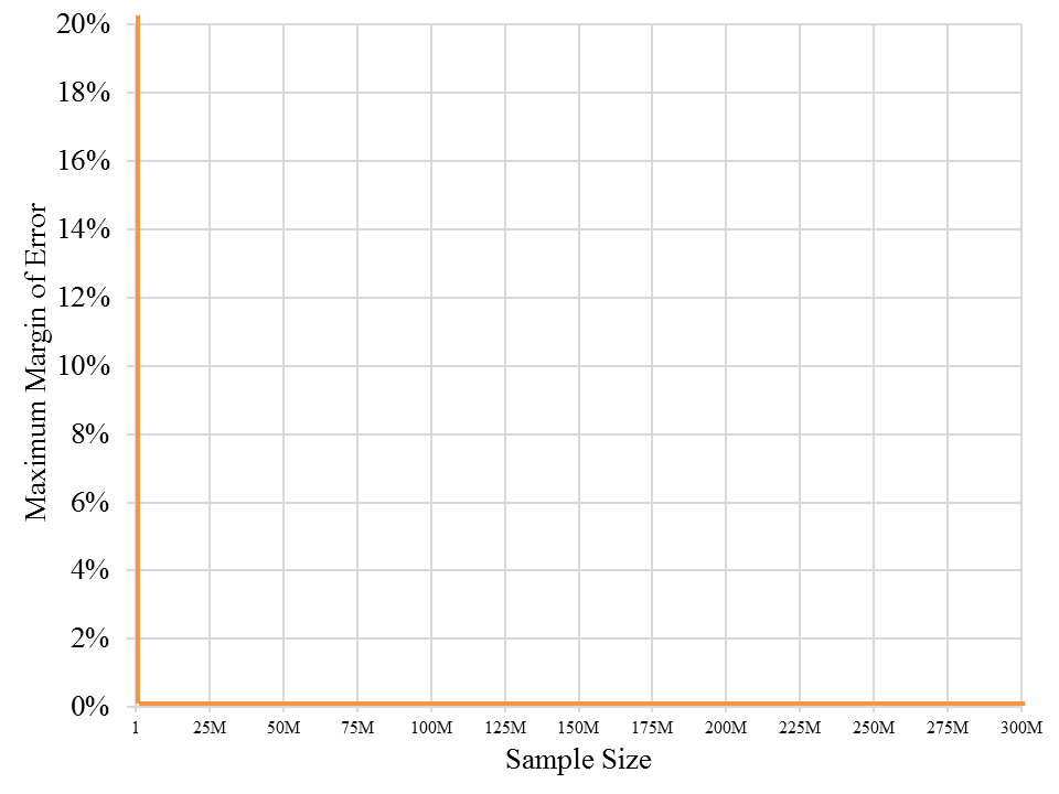 Faced with the impossibility of a meaningful chart displaying the margin of error for all sample sizes, we built an interactive chart that allows a viewer to click and progressively zoom in to the tiny slice of the chart where sample size really matters. The first chart above does that. Move the pointer along the curve to determine the margin of error for any specific sample size. Click and drag the pointer to highlight just a slice of the graph, and it will zoom to that slice. Keep zooming as close as you want, or double click to revert to the original.
This chart does not, however, go all the way out to 310 million. Even with a zoom-able chart, the numbers are too big (Internet browsers cannot handle 310 million data points on one interactive chart). And more importantly, it just wouldn’t matter. That’s the crux of the sampling story. Adding another ten thousand, one million, or ten million people into your sample does not matter. It does not get you much closer to an accurate estimate because you’re already there with just 2,000.
Perhaps an interactive chart like this can make statistics and sampling a bit more engaging for those who feel cursed by math. At the very least, the chart will hint at the mind boggling nature of the numbers, and help you ponder the implications of an efficient and effective sample size. Go ahead with zooming in and zooming out, noting how fast or slow the margin of error changes and the slope of the curve, and consider these key points when it comes to sampling and sample size:
- If you have the budget for a large sample, don’t even consider going beyond a couple thousand, as you gain so little. Beyond a sample size of 2,000 (which gives you a margin of error of about ±2%) you would have to pull an additional 4,700 into your sample (for a total of 6,700) to gain just one more percentage point in precision. The benefit of doing this will almost never exceed the cost of including that many more people in your sample.
The exception: If you need to understand segments or subgroups within your sample, choose your sample size based on the precision you need for those smaller groups, not the sample overall. - With a small sample there is a substantial gain in precision for every random person you add to the sample. The difference between a sample of 1,000 and 1,075 is relatively small, decreasing the maximum margin of error by just a tenth of a percentage point. But the difference between a sample of 50 and 125 is dramatic, decreasing the maximum margin of error by more than five percentage points. Another twenty five, fifty, or one hundred respondents can make an important difference when you’re at the left end of the chart.
- The most important decisions you need to make happen in the relatively tiny area between about 100 and 1,200. For each additional 50 or 100 people you include in your sample, you gain a decent improvement in the precision of your estimates. So the questions to consider are always (1) how much precision do you really need, and (2) what is the cost of including each additional person?
In academic journals you will find studies with sample sizes as small as thirty to fifty people. Some of the healthcare research we do relies on samples sizes of fifty to one hundred. Most other research we do, including that for publication in media outlets, relies on samples ranging from 300 to 1,200. As for what others consider to be appropriate sample sizes, we scanned for a handful of recently published public opinion polls:
- An Associated Press (AP) national poll conducted last month in March used a random sample of 1,229 U.S. adults.
- A Reuters poll a few weeks ago (in March and April) relied on a random sample of 1,486.
- A Harvard-CAPS (Center for American Political Studies) Harris Poll in March relied on a sample of 2,746 registered voters.
- Gallup’s most recent telephone-based survey reached out to sample of 1,002 adults, splitting the sample with 502 receiving one version of the survey and 500 receiving another.
The chart, by the way, is based on simple, open source java script that can be used to display other types of marketing and market research data. It is an especially useful way to visualize data if you have thousands of data points and want to show the big picture while being able to drill down into details. Here are more examples. Many thanks to Ben Wang for his programming, advice, and consultation.
Of course this chart, as fun as it is, will not tell you exactly the sample size to choose within that range from 100 to 1,200 because crucial external factors come into play as well. The cost-benefit ratio of a larger sample size shifts rapidly from one end of this range to the other. The tipping point will depend on the particulars of your research study, including its purpose, your audience, and how difficult it is find appropriate respondents.
But if only there were a magic number for sample size, whether it be thirty, one hundred, three hundred, or one thousand, right? Well, don’t despair. Try this magic number: (312) 348-6089. We have a great deal of experience choosing sample sizes and consulting with research, marketing, and communications teams on the key questions that need to be answered within constraints of time and budget. As always, the magic is not in any number itself, but in the highly skilled way in which it is deployed and then turned from data into stories.
Some statistical fine print. The interactive chart shows maximum margins of sampling error (commonly referred to as margin of error) for various random sample sizes at the 95% confidence level. But there are multiple sources of potential error in surveying not accounted for in the chart. Such sources include coverage error, nonresponse error, measurement error, and post-survey processing error. In most cases it is not possible to quantify these additional sources of error.
Stories from the Versta Blog
Here are several recent posts from the Versta Research Blog. Click on any headline to read more.
How Long Should A Survey Be?
Research consistently shows that surveys should be kept under 20 minutes, and that longer surveys lead to lower quality data.
Five Research Design Tips
Good research depends on excellent research design. Here are five design tips from for putting together a superb market research project.
One Lousy Question Can Cause Massive Measurement Error
A recent experiment on whether people report owning a bank account shows the huge risk of adding caveats and clarifications to a survey question.
Two Secrets of Writing Great Research Reports
Research reports should be short and to the point, but also richly nuanced to capture the complexity of reality. How do you do both?
Here’s Why Silly Surveys Are Actually Dangerous
You might think reader polls or silly surveys about aliens and toilets are just good fun; we hope this disturbing example will convince you otherwise.
Conflicting Surveys Give You Insight
When multiple surveys give different results, you gain an opportunity for understanding your topic in a way you might not get otherwise.
Research Should Focus on Your Customers, Not on Your Products
An HBR article suggests that what we need is market research focused on people rather than products — social scientists are best for this.
When to Kick Out a Survey Respondent
Helpful survey and programming tip: Terminate unqualified respondents AFTER they answer all screening questions. We explain why.
Versta Research in the News
Wells Fargo 2025 Money Study: Sticker Shock and Secrets
Following last year’s successful launch of The Wells Fargo Money Study, Versta Research again surveyed more than 3,000 U.S. adults and teens, this year focusing on inflation, sticker shock, financial secrets, and financial advice that Americans are sick of hearing about. The 2025 study garnered attention and features stories on CNN, USA Today, CNBC (video), Bloomberg, Yahoo Finance (video), among others. A full report is available for download, in addition to Wells Fargo’s press release and microsite dedicted to the study.
Recap: Survey Findings about Gen Z Employees
In 2024 The Standard released new position papers to help employers attract and retain Gen Z workers, featuring research commissioned from Versta Research with three groups: Gen Z Workers, HR Decision Makers and Managers of Gen Z. The full suite of position papers includes: (1) Insights about Gen Z’s expectations for employers, (2) An analysis of how employers can use carriers to attract and retain Gen Z, (3) A look at Gen Z’s goals and what they mean for employers, (4) A focus on how HR managers should shift their messaging to appeal to Gen Z, and (5) An appeal to boosting Gen Z financial literacy in the workplace. There is also an infographic called “Helping Gen Z Succeed” that sums it all up. Research findings were recently featured in news articles on Benefits Pro, Business Insider and Plan Advisor.
Recap: Versta Research at the American Marketing Association
Joe Hopper, president of Versta Research, spoke to an audience of marketing and research professionals about trends that are shaping our work in 2025. Here is a video recap of the presentation:
Versta Research Celebrates Sweet Sixteen in 2025
January marked our 16th anniversary of Helping You Turn Data Into StoriesTM with customized research and analytical expertise. We’ve grown more than ten-fold in those sixteen years, and hope it still feels like YOU are Versta’s most important and only client.
MORE VERSTA NEWSLETTERS