July 2017
Dear Reader,
Of all the many components that need to come together for great research, one piece not often discussed is the art and science of getting people into your study. Recruiting respondents is part targeting, part persuasion, and part persistence. For researchers, it is probably the closest thing we do to actual marketing.
In this newsletter we unveil our Snazzy Revamp of Survey Invitations. It showcases a new template we designed with careful attention to elements of content, layout, and user design that can make or break the success of a survey.
Other items of interest in this newsletter include:
- Truly Amazing Stats about Phone Surveys
- Help Save the Census Today
- Lousy NYT Survey Makes Researcher Cringe
- How to Ask Gender on Surveys
- Does Starting with a Story Bias Your Findings?
- PR Studies: Advice for the Research Team
- Public Release Studies: Advice for the PR Team
- Versta Blog Makes Public Opinion Quarterly
- Five Cautions for Crowdsourcing
- When to Use Multi-Check vs. Yes-No Questions
- Good Reasons to Ask Bad Questions
We are also delighted to share with you:… which highlights some of our recently published work in Quirk’s.
As always, feel free to reach out with an inquiry or with questions you may have. We would be pleased to consult with you on your next research effort.
Happy summer,
The Versta Team
A Snazzy Revamp of Survey Invitations
Given the zillions of requests consumers get to fill out surveys regarding every moment of their lives these days, it’s no secret (and no surprise) that most surveys get miserably low response rates.
But there are still ways for you, as a researcher, to cut through all that clutter and noise. With a smart approach, your audience will pay attention to your request and provide you with the information you need. How? Give them good and legitimate reasons to participate. Give them information they need. Be respectful of their time.
While most surveys get response rates of roughly one to two percent, we at Versta Research have been able to achieve response rates of 20% to 40% for some of our most important surveys in just the last few months. There is a lot of strategy that goes into this, including timing, incentives, multiple contacts, and dual modes of recruiting. But one of the most important is carefully and strategically designing an effective, persuasive survey invitation.
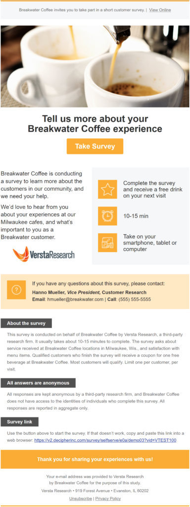
This year we built a new template for our survey invitations. We thought through every word, every design element, and every bit of coding. Here is a close look at what we did and why we did it …

… with expert advice on how to write a survey invitation for your next fieldwork campaign.
Put crucial information “above the fold.” Survey respondents need to know right away:
- Who you are
- Who the sponsor is
- What the survey is about
- What you are offering
- How long it will take
All of this information needs to be offered above the fold (before having to scroll down) and it needs to be exceptionally succinct.
Our strategy is use a short headline, two brief sentences (maximum), and three bullet-like icons in a side bar so that all crucial information can be absorbed in 10 seconds or less. We also add a corporate logo, either ours or yours, to establish who the survey is from.
Even those who want more information will appreciate how clear, direct, and simple your above-the- fold information is. If they don’t jump in right away, it will prompt them to scroll down for more.
Offer a quick and easy call to action. Make it obvious what you want your recipients to do, and make it super easy for them to do it. To accomplish that, take a page from the playbook of our web-savvy marketing colleagues: Design a big beautiful button with the words “Take Survey” and put it right after your headline (above the fold!). Before you launch, be sure to test and re-test so that you know the button actually works, and that it works on multiple browsers and e-mail clients.
Speaking of making it easy, we suggest a call-out noting that the survey can be completed on smartphones, tablets, or computers. You want people taking the survey right away no matter what device they are on. If they don’t, chances are slim they will return later. (Um, your survey is optimized, responsive, and physically tested on all types of devices, right?)
Lay out lots of details … later on. Many will never scroll below the fold. That’s okay if you’ve provided crucial information and your call to action up top. But others want more information, and you need to provide it. Providing details will answer legitimate questions that cautious recipients have. It will make fieldwork go more smoothly, because fewer people will contact you to complain. And it will fulfill your legal obligation to tell recipients about privacy, and how they got on your list. Here are the additional details we suggest:
- Whom to contact with questions. Offer a real person’s name, job title, email address, and phone number. Providing these details will establish credibility and trust. Oddly, the result is that fewer people will contact you, and more will take your survey.
- About the survey. Describe what kinds of questions the survey includes, what is involved for the respondent, and any qualification criteria. You don’t want people feeling misled by your invitation, especially if they may screen out of the survey early on.
- How the data will be used and analyzed, for what purposes, and what protections you have in place to assure the confidentiality of all responses.
- The survey URL for cutting and pasting if an email application or script blocker has disabled your beautiful “Take Survey” button.
- More about who is paying for the research, who is actually collecting the data, and who is analyzing it. Full disclosure establishes needed trust and credibility among cautious recipients who may not take your survey otherwise.
- Spam compliance details, including who provided you with the recipients’ email information, your physical business address, an option to unsubscribe from additional invitations, and ideally a link to your privacy policy.
Use good design. Good design means both graphical design and user design. On the graphical side, we experimented with many drafts to get a clean, contemporary look that makes use of flat icons and spaces defined by color instead of lines. We always include a high quality professional picture because we know from social media that images, not words, grab attention.
On the user-design side, we incorporated border and design elements to make a long invitation feel easy and short. Punchy information and important facts are on top. A colored band with contact information creates a fold. A thank-you box separates the footnote containing legal stuff from everything else.
We also included a small, pre-header text at the very top of the invitation. Its sole purpose is to feed text into email preview mode, which recipients see before opening the invitation. It is small and unobtrusive, so once the email is opened, recipients ignore it and focus on our headline and call-to-action instead. But think carefully about the words here, because pre-header text can make all the difference in whether recipients even bother to open an email.
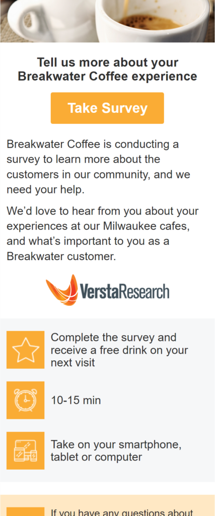
Finally, we had the template professionally coded so that it adapts to mobile devices and the visual design blocks re-sort exactly as we want them to. For example, here is what happens to our survey invitation on smaller mobile devices:

Even on a phone, we’ve carefully laid out what we want recipients to see: first the headline, then the call to action, then a two-sentence description, followed by how much they get, how long it takes, and so on.
Of course one size does not fit all, and we certainly have clients who prefer a more traditional approach (paragraphs of text, a URL to click, no pictures or icons or visual maps, and so on). That’s fine; we are happy to adapt our approach.
But here you have a good starting point. This invitation works. It gets high open-rates and click-through rates. It provides quick and easy-to-find information, while also providing details. It generates few complaints, spam reports, or contacts with questions. It overcomes resistance and inertia. It establishes trust and credibility. It conforms to legal and privacy best practices. And most importantly, it succeeds in getting people to respond.
Stories from the Versta Blog
Here are several recent posts from the Versta Research Blog. Click on any headline to read more.
Truly Amazing Stats about Phone Surveys
It’s no surprise that telephone surveys are on their way out. But the stats on just how hard and costly it has become to conduct phone surveys may astonish you.
Help Save the Census Today
You may not even realize it, but good Census data is crucial to your work in research and marketing. The Census is in danger, and here is what you can do!
Lousy NYT Survey Makes Researcher Cringe
The New York Times is usually an exemplar of reporting excellent research and polling. This front-page survey about men and women in the workplace is an exception.
How to Ask Gender on Surveys
Asking gender on surveys used to be easy, but now even the Census and other gold-standard surveys are considering new options. Here are current best practices.
Does Starting with a Story Bias Your Findings?
Writing dream headlines to guide your research does not bias it any more than hypotheses do. The secret is to search for evidence that will refute your story.
PR Studies: Advice for the Research Team
If you are on the research side of a PR campaign that deploys a survey for news, here are five tips from Finding Stories: Building Better Research for PR Campaigns.
Public Release Studies: Advice for the PR Team
Here are five hot tips for PR professionals to ensure a successful research-for-PR effort, excerpted from Finding Stories: Building Better Research for PR Campaigns.
Versta Blog Makes Public Opinion Quarterly
We have long maintained that phone surveys are almost dead. The latest issue of POQ puts one piece of our claim (citing the Versta Research Blog) to the test.
Five Cautions for Crowdsourcing
Experimental consumer research now relies heavily on respondents from MTurk. If you are considering MTurk for your research, here are guidelines to keep in mind.
When to Use Multi-Check vs. Yes-No Questions
Here are two ways you might ask the same question, but probably get different answers. Both are good formats to use, so it just depends on what you need most.
Good Reasons to Ask Bad Questions
In our own super-short client satisfaction survey, we added a “bad” question on purpose. The reason? It builds rapport with clients who expect us to ask.
Versta Research in the News
Survey Says … Trump Won?
Versta Research’s analysis of election polling for the 2016 presidential campaign, along with five lessons for market research, was picked up by Quirk’s media and re-published in April.
Wespath Benefits & Investments Reports on Health Research
Versta Research completed the 2017 wave of a biennial effort to understand and track clergy well-being nationwide. Findings, including a comparison to matched samples from NIH data, have been posted by Wespath’s Center for Health.
MORE VERSTA NEWSLETTERS

