

Testing Your Data for Illusions
Here’s a useful way to think about statistical significance. When looking at your data, what’s the probability that it looks like something is there, when in fact nothing is there. Randomness in data (because of sampling) often causes illusions. So testing for significance is all about measuring whether the patterns we see in our data are likely to be illusions.
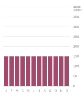
Here’s a nice example from monthly trend data. Let’s assume that the month-to-month reality is that the numbers are exactly the same. So if we were to survey everyone, the chart would look like this:
Of course it’s awfully hard to survey everyone, so instead we pull a random sample. Well, even if the reality is exactly as shown above, it is just as likely that our sample will generate data that looks like this:
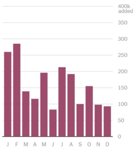 Many of us would see this chart and say there is a downward trend over time. Paying attention to tests of significance will save us from that error.
These illustrations are from the New York Times, which recently published an interactive simulator of jobs data. The simulator cycles through millions of random combinations, all of which fall within the standard margins of error, to demonstrate just how tricky it can be to discern patterns in data with survey samples.
Need help differentiating the real stories in your data from illusory fairy tales? Versta Research would be happy to assist. Give us a call any time at (312) 348-6089.


