

Tips on Easy Data Visualization with Excel
At its core, data visualization is about using visual techniques as shortcuts to understanding patterns in data. Some of the newer tools available in common programs like Excel provide an excellent means for visualizing data. This can save you time and it can point you in the right direction for rigorous analysis.
Here is an example from our recent work. We had a working data set with 107 variables. We wanted to know whether we could reduce these down into a smaller set of variables using techniques like factor analysis and scaling. We were planning to use linear regression techniques as well, so we wanted to be aware of any collinearity issues.
Our first step in getting familiar with the data was to run a bivariate correlation matrix. This resulted in a matrix of 11,449 coefficients. High correlations would suggest potential collinearity and opportunities for data reduction. Not so long ago, it was not feasible to review so many coefficients in a single matrix. But now we can use color rules in Excel to create a “heat map” that makes this possible:
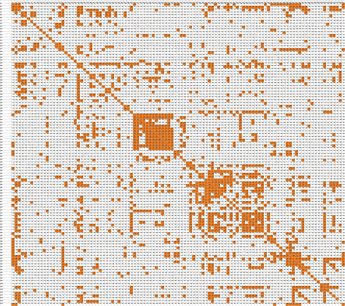
107×107 Correlation Matrix with Excel Color Rules Used to Flag Higher Correlations
Clusters of orange show logical groups of variables that are highly correlated, making them candidates for data reduction through factor analysis. Long strings of orange (in rows or columns) point to specific variables that are highly correlated with many items in the survey, suggesting redundancy, collinearity, or maybe even a valuable finding.
Here are some tips to creating this type of visualized map:
- Keep your data set in a logical order (probably the order in which survey questions were asked) so that clusters represent logical relationships rather than random ones
- Run a full matrix of bivariate correlations (we used SPSS syntax because 107 variables exceeds the limits of the SPSS Windows interface)
- Export the output to Excel
- In Excel, remove rows showing n-counts and p-values
- Select the entire sheet and create a cell fill rule (our rule was to fill the cell with orange if the cell value was greater than .1)
Data visualization is not just about fancy charts (or purchasing expensive software to make them) but about simple graphical techniques to work smarter and more effectively. In this case it was also just a first step towards advanced statistical techniques, which included factor analysis, reliability analysis, linear regression, logistic regression, CHAID, and cluster analysis. And advanced statistical techniques are, of course, just an interim step in making sense of the data and turning it all into clear and compelling story.
Need help sorting through all your data, making sense of it, and turning it into a story? That’s what we do, so feel free to reach out.
—Joe Hopper, Ph.D.


