Here’s When Pie Charts Work
For every research rule or best practice I proclaim, I find myself doing the opposite eventually. Such is the case with pie charts. I try to avoid them, taking to heart Edward Tufte’s claim that they are dumb and should never be used. Studies show that pie charts do a poor job helping readers grasp parts vs. wholes because our eyes are not good at judging relative proportions based on angles of pie slices. So I opt for bar charts whenever I can.
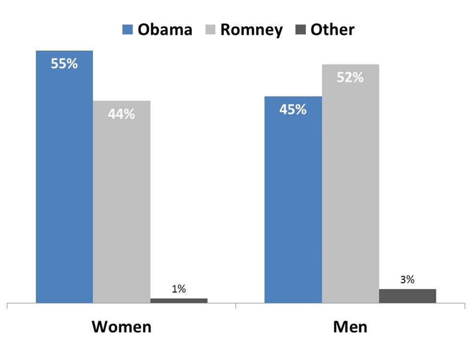
But in one recent effort we found ourselves drawn to pie charts as a superior option. We wanted to show the proportion of men vs. women who voted for Obama vs. Romney in the 2012 election. The story we wanted to communicate was that most women (indeed, a majority—more than half) preferred Obama while most men (a majority—more than half) preferred Romney. Here is how the data looked when laid out in bar charts:
 These charts are not so good. They communicate that women prefer Obama over Romney, and men vice versa. But they do not effectively communicate the idea of more than half, which is usually critical to election outcomes.
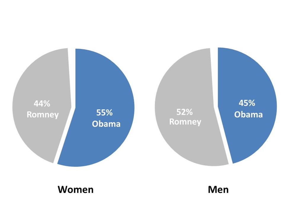
So we gave pie charts a shot:

I think these pie charts are extremely effective in conveying this data and the story. They are much better than the alternative.
Why do pie charts work in this case? First, the data are exceptionally simple. There are just two categories shown in each pie chart. In fact, we decided to leave the “other” category off the chart, though the visual gap makes it clear.
Second, our eyes are good at discerning pie slices larger than a half circle or less than a half circle, and indeed it is that relative comparison to “half” that is important to this story.
OTHER ARTICLES ON THIS TOPIC:
Why You Should Avoid Pie Charts
Visualizing Data: Six Hints on Using a Pie Chart


