Yes, You Can Use Grids on Mobile Surveys
Sometimes technology moves so fast it solves a problem before we solve it in other ways. Such is the case with grid-type questions and mobile surveys. People are doing surveys on mobile devices all the time now, so researchers are finally re-thinking how to design surveys. Getting rid of grids has been one mantra of optimizing for mobile.
But hold on. Well-designed and user-friendly grids work really well on desktops and laptops, which are still the devices-of-choice for most. And it turns out, good survey platforms are now available that allow for grids on larger screens that can accommodate them, but brilliantly transform them into a series of single response questions for smaller devices.
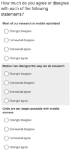
Here is an example of what happens on our survey platform. The first shows the grid on a desktop computer. The second shows how it automatically adapts to a phone.

Grid questions as they appear on a desktop

How the grid adapts to a phone display
Using this platform still takes thoughtful awareness of the user experience on different devices. For example: (1) We use bold font in the grid row labels to differentiate the single response questions if it adapts to mobile; (2) We shade every other grid row for exactly the same reason.
The adaptability of this platform means that if you like using grids (and promise to use them judiciously and responsibly) then there is no reason to dump them in the rush to join the mobile frenzy. Just be certain that your survey platform can adjust the grids as elegantly as this platform does.


