Bad Charts and Good Charts for Kony 2012
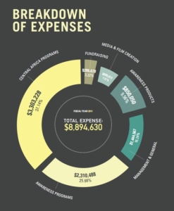
We came across this chart from Invisible Children, the group that produced the Kony 2012 video. It shows the organization’s expenditures by category. It is a poorly designed chart for three reasons:
1. The pieces of the doughnut are not correctly proportional. For some reason, the arc widths were compressed for some categories (like Media & Film Creation) distorting the true size of the relationships among categories.
2. Information is squeezed onto the chart in such a way that some of it is unreadable. Even if you click on the chart to get a full-sized image, it is difficult to discern the numbers for the Media & Film Creation category.
3. Percentages are shown to two decimal places, which is unimportant. Why add extra numbers if they don’t convey extra information?
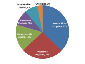
A better way to create the chart is shown below. It is less snazzy. But it shows the important data (the relative sizes of each expense category) accurately.
Even so, this chart is probably not the best choice, either. Pie charts are excellent for showing relative proportions of the whole, but once you have more than four our five slices, it is usually too much information for this type of chart, and your brain does not really process those relative proportions.
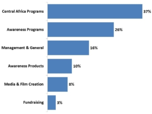
Here’s our recommendation for the best chart. We lose the advantage of a pie chart which automatically conveys the idea that each component is a non-overlapping part of the whole. But all the information is easy to read and compare, and all proportions are immediately and visually accessible.
 Visualizing data with simple and effective charts is one critical piece of telling a good story. Versta Research can help you with that.
—Joe Hopper, Ph.D.


