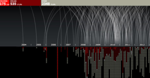
Two Examples of Animated Data Visualization
As market researchers pay more and more attention to the need for compelling data visualizations, Hans Rosling’s work with interactive data is becoming a catalyst for a fascinating new type of data visualization: animated statistical graphs. He uses them to show world social and economic trends over time, and the effect is exceptionally powerful. Here is a video of his TED talk well worth watching, in which the first eleven minutes are focused on interactive graphs:
Others are following his lead, though not always to the same superb effect. Here is another animated statistical graph, this one documenting drone strikes and fatalities in Pakistan:
 In my view, this second one is interesting and it represents a worthy effort to explore animated presentations of data. But the animation does not add anything beyond the full, finished graph at the end. It is like animated PowerPoint presentations: They (sometimes) look cool, but so what? It is a great reminder that new innovations in market research and public opinion polling must be carefully matched with specific needs.


