How to Select the Type of Chart to Use
Data visualization will likely be one the biggest areas of innovation and development over the next several years. This is a good. A chart that clearly and succinctly displays detailed data in a way that captures the viewer’s attention and helps interpret the data can be incredibly powerful. Edward Tufte, a pioneer in this area, has been making that case for years. Of course a lot of Tufte’s examples have required sophisticated graphics and professional designers, which have put the “ideal” out of reach for most.
As fancy charts and graphics become more accessible to everyday users, we think it is critical to revisit the basics of charts. Many charts, even easy ones, are poorly conceptualized and poorly executed, which is even worse than showing your manager no chart at all. It is critical to understand what kinds of charts best display different types of data and highlight specific kinds of relationships you are trying to show.
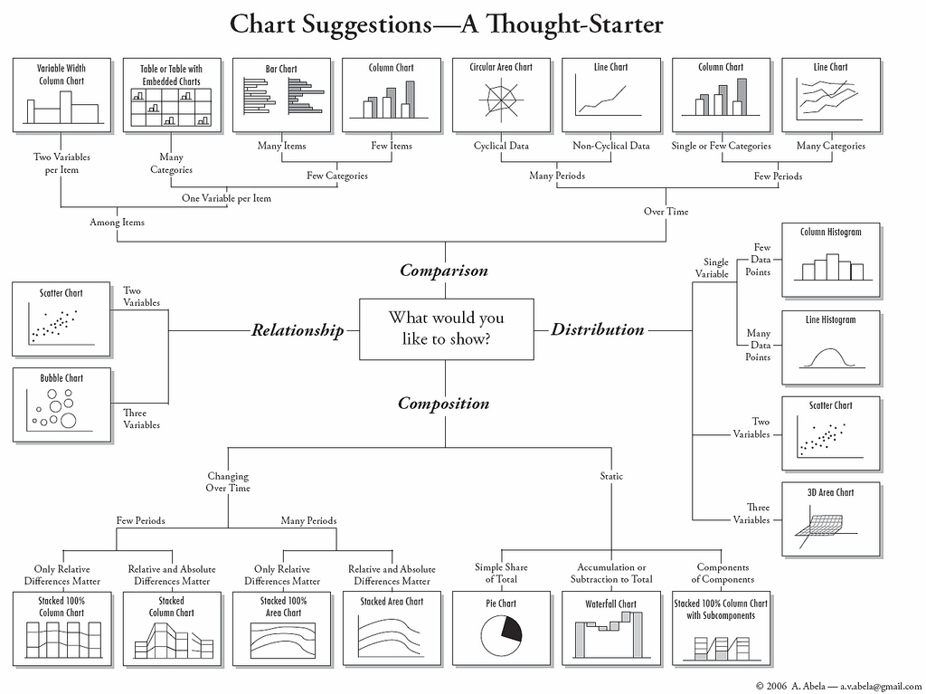
In this spirit, we offer you this handy chart, designed by Andrew Abela. It provides a starting point for choosing which type of chart will most effectively display your data based on the story you are trying to tell.

This diagram helps you select the right chart for your needs, including pie charts, bar charts, column graphs, bubble charts, histograms, and so on. You can click on the image for a full-size jpeg of the chart.
Of course this is just a starting point, but it highlights the idea that all charts are not the same. Pie charts, bar charts, column charts, and bubble charts are not interchangeable. If you would like some help thinking about your data and how best to present it powerfully with a chart or image, feel free to reach out to us. We would be happy to help.
–Joe Hopper, Ph.D.


