Google Surveys Stumbles with Sneak Peek Mess
Sometimes data visualization is too compelling for it’s own good. People are impressed by the beautiful design, and they look right past the utter nonsense being presented.
This is “beautifully” illustrated by Google’s rollout of the first of many new features of their survey tool. Here’s the email they sent:
We’re excited to announce that Google Surveys is the new name for Google Consumer Surveys and is now part of Google Analytics Solutions. In the coming months, a new look and feel will roll out, but in the meantime there are no immediate changes that will impact your use of Google Surveys. Interested in what the new Google Surveys will look like? Below is a sneak peek of the exciting changes we’re making including crosstabs for all questions! This is only the beginning! We plan to continue to iterate on Google Surveys and offer new features in the coming months. We look forward to sharing more with you soon. Happy Surveying! The Google Surveys Team
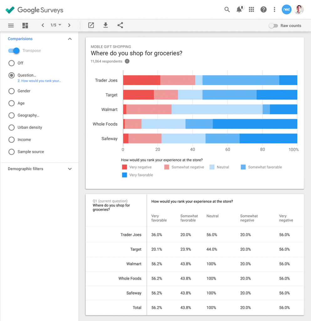
Here’s the sneak peek:
 It is pretty and slick, and it offers the promise of immediate insight, analysis, and visualization right at my fingertips. But it is ridiculous. The numbers in the table are not accurately shown in the chart. In fact, the numbers in the table make no sense at all. It seems like the rows ought to add up to 100%. But it’s hard to tell because respondents were asked to “rank” (not “rate”) their experiences. Were they sorting these stores into some sort of top-down hierarchy? Presumably the chart is about mobile gift shopping, but the bigger title suggests it is about where people shop for groceries. Where do people shop for groceries, by the way? This chart does not tell us.
Okay, I understand Google dummied-up this graphic just to show us what things will look like. But why not dummy it up so it is right, instead of wrong? The depressing implication is that it just doesn’t matter. Google surveys can turn ridiculous random numbers into beautiful exciting insights, and nobody will know the difference.
At Versta Research we rely on all kinds of survey tools in our work, including the occasional Google Survey if the need is small and limited. But this is a good reminder of how shallow this tool is (along with most other tools) even with all those exclamation points. No matter how fancy and dazzling these tools are, and no matter how much they promise that technology is changing everything, research tools do not deliver insight. Only research brains like yours and ours can do that.


