
 Venn Diagrams")
Beautiful (and Mostly Accurate) Venn Diagrams
Venn diagrams are useful conceptual tools, which is why business people love them, and why programs like Word and PowerPoint incorporate them into their suite of “smart art” tools. But as useful as they are conceptually, Venn diagrams are also maddeningly tricky and problematic for data visualization.
One reason is that accurate Venn diagrams are usually (mathematically) impossible. Two circles are no problem. But three or more circles will nearly always require squishing some pieces out of proportion in order to get other pieces closer to their true values. You need a fancy optimization algorithm to help minimize the overall error among all the pieces, and you have to accept that your Venn diagram will be an approximation.
A second reason is that humans are notoriously bad at visually assessing geometric proportions and areas. Start developing a few Venn diagrams and comparing alternative solutions, and you’ll see how difficult it becomes to decide which is right. Is that little moon-shaped piece which is supposed to represent 12% really bigger than the oval-shaped piece that represents 4%? Trust me, it will make you crazy.
As such, we usually avoid Venn diagrams. They are inaccurate and in most cases not visually useful. (Take a look at some examples from Pew. Do you find these visualizations to be helpful?) But occasionally if all you want to show is (1) the relative size of the circles and (2) the idea (not the specifics) that there can be more or less overlap, then Venn diagrams work well. Here, for example, is one we created showing usage of desktops, tablets, and phones for a specific type of online shopping:
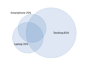 To create this, we used a relatively simple R statistical package called venneuler. There are other tools available on the market as well.
Want the specifics of how this chart was done, or need help figuring out the best charts and visualizations for your data? We are happy to assist any time. Feel free to give us a call at (312) 348-6089.


