Better Charts for MaxDiff Data
The New York Times is one of the few organizations trying to push our industry further in developing better data presentation and visualization techniques. Sometimes they do a good job, introducing rich, informative, engaging, and interactive charts that would make even Edward Tufte, the contemporary pioneer in data visualization, proud. Sometimes they do a not-so-good job; and indeed we can learn from that as well.
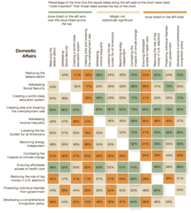
Here is a chart they printed several weeks ago on the op-ed page:
In print, the chart was black and white and gray, making it especially difficult to decipher. But even in color, how long does it take a reader to make sense of this? How many readers do make sense of it? How many readers (and how many of our clients, managers, and executives who make decisions) want to take the time and do the mental work of reading and interpreting all this data?
I gave up. Charts should support a story. This just shows lots of data.
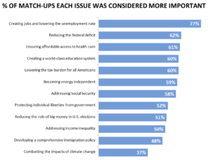
I was particularly struck by the chart, as well, because the data are from a MaxDiff exercise, which the columnist referred to as “clever.” The thing is, data from MaxDiff lend themselves perfectly to an exceptionally simple, intuitive, and compelling type of chart: a horizontal bar chart, which would have looked more like this:
The story here is quite clear. Jobs matter a lot, far more than anything else. Climate change matters much less. And there is not much differentiation among a whole variety of issues in between.
For more ideas on presenting MaxDiff data, you can read our post for advice on how to scale and present MaxDiff utilities. You can also read additional articles we offer about optimizing data visualization. Of course you can also give Versta Research a call (312-348-6089) any time for help turning data into a story, which is the real secret behind all successful data visualization techniques.
—Joe Hopper, Ph.D.


