How to Make a Beautiful Market Share Chart
How do you make a beautiful, elegant, intuitive, and useful chart showing changes in market share over time? In R. That always seems to be the answer these days when it comes to data visualization as well as data analysis. It is the reason that we at Versta Research are in the midst of an intensive course of training and retraining in R. Here is just one beautiful example of what R can do.
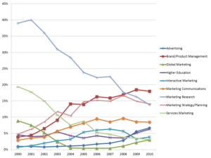
This first chart we created the old-fashioned way, using PowerPoint. It shows membership in interest groups over a ten year period within the Chicago AMA (American Marketing Association). Of particular interest to us was the sharp decline in Market Research. The other interest groups get tangled up and are hard to read.
This market share chart was created in PowerPoint
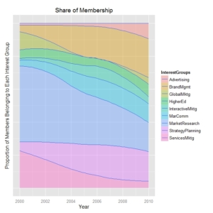
In this second chart, we took the exact same matrix of data, and created a chart using the ggplot function in the ggplot2 package for R.
This market share chart was created in R
It is a far better visualization of market share changes over time. Guaranteed, nobody in your boardroom will be squinting at data points trying to untangle what this means.
By the way, R is open source and free. It is quickly becoming the statistical computing software of choice across a range of disciplines, including business, finance, healthcare, and so on. The learning curve is steep, but also a reminder of why it is critical for market research firms to continually invest in learning and development. Clients depend on us to help them stay at the forefront of market research methods and knowledge.
—Joe Hopper, Ph.D.


