

Try Using Tables Instead of Charts
One memorable lesson from reading Edward Tufte’s books about visual displays of quantitative information is that charts are not the only way to display data. Indeed, they are sometimes a worse way. We should always at least consider a table as a superior alternative:
Tables are clearly the best way to show exact numerical values, although the entries can also be arranged in semi-graphical form. Tables are preferable to graphics for many small data sets. A table is nearly always better than a dumb pie chart; the only worse design than a pie chart is several of them, for then the viewer is asked to compare quantities located in spatial disarray both within and between pies.
So when you find your self stuck trying to visualize data graphically, either because it is too simple or too ridiculously complex, try using a table instead. And remember that beautiful, compelling data tables that instantly communicate information require as much thoughtful design as charts do.
Here are a few tips for designing tables that Turn Data into StoriesTM:
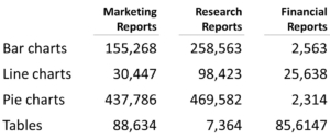
A Good Table
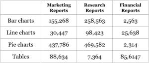
A Bad Table
- Remember the phrase “percentage down, compare across.” It tells you which way your rows and columns go. Read down the column for a distribution of answers; read across the rows to compare answers between different groups.
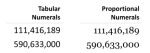
- Use a font with tabular numerals instead of proportional numerals. Tabular numerals take up the same amount of horizontal space. This makes it easier to compare numbers because all the ones’, tens’, hundreds’ (etc.) places line up.
- Right align (or decimal align) your numbers. This makes it easier to compare numbers because all the ones’, tens’, hundreds’ (etc.) places line up. And while you’re at it, right align your column headers, as well, to create a clean visual column.
- Left align your row text. This helps you create an implied visual border without unnecessary lines or boxes.
- If possible, avoid using lines or rules, especially vertical ones. If other elements are designed correctly (like tabular numbers that fall into perfect lines, text alignment that creates a visual border, etc.) the beautiful white spaces in your table will make them unnecessary.


