Using Mekko Charts to Show Market Share
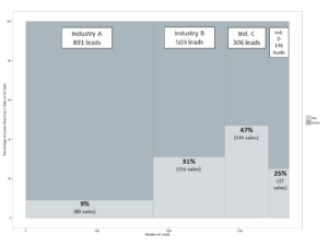
An extremely useful chart rarely used by market research professionals is a mekko chart, sometimes referred to as a marimekko chart. It is a stacked bar chart, but (1) the width of the bars varies in a meaningful way and (2) they are lined up next to each other. Usually the bars vary in width according to market share. This means that the surface area of the chart represents the total market, and each component of the chart is proportional to its share of the total market.
Here is an example:
Most sales leads came from industry A, and the width of column A reflects that. Even though Industry B has a lower conversion rate than industry C (31% versus 47%), it’s volume of sales is higher (156 versus 144) which is shown by an appropriately proportioned rectangle.
A mekko chart shows you not only differences among segments, channels, or markets, but also the relative size of those segments, channels, or markets. We have recently used mekko charts to show:
- How consumers in different age cohorts inquire about, and follow through with, a promotional offer (width of the columns reflects age cohorts of different sizes)
- How many social media posts about brokerage accounts mentioned fees, split by which brokerage firm they were talking about (width of column reflects the number of posts mentioning each brokerage firm)
- A client’s overall market share by segment of the market (width of columns reflects size of market segment)
One reason that mekko charts are rarely used is that standard software packages do not include them, which has made them difficult to create. In the past we created them with complicated work-around techniques in Excel and PowerPoint. Now we create them with free software from the R Project for Statistical Computing. R is “an integrated suite of software facilities for data manipulation, calculation and graphical display,” and is can create beautiful mekko charts with just a few lines of code.
If you would like a demo or need a bit of help creating your own mekko charts, feel free to give us a call.
–Joe Hopper, Ph.D.


