A Beautiful Chart: Trends in Conjoint Analysis
Whenever I see a chart like this, which shows proportions of a whole changing over time (or in PowerPoint language, a time series of 100% stacked bar charts):
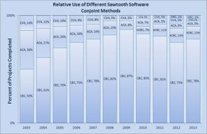
From Sawtooth Solutions, Spring 2013
I picture to myself how much more visually compelling it would be if it were done in R, like this:
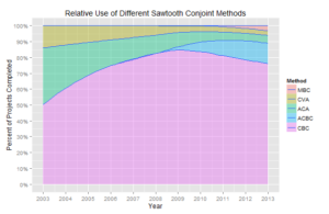
Same Data, Created in R
This second chart is not just more beautiful. It tells a story that is grasped immediately. Namely, ACBC has been supplanting other methods over the last few years; before that, it was CBC supplanting other methods.
The R chart is by no means perfect. First, it does not show all the numbers behind the graphics, as the first chart does. But it would be easy to supply a small, accompanying table that would do that. Second, it shows a slightly odd overlap between 2008 and 2010, and if you look carefully, you’ll notice that the lines elsewhere do not cross the grids at exactly the right data points. This is because we are using a loss function to create smooth trend lines. But with some minimal effort, we could tweak this to get more precision.
We created this chart using the R open-source statistical computing environment. It uses the “ggplot2” and “plyr” packages and is easily generated in just a few lines of code. To be sure, we still create plenty of charts and graphs the old-fashioned way in PowerPoint. Sometimes creating charts in R offers no advantages. But when it comes to times series data like this, I would almost always decide to create a chart in R, especially if I were presenting this to a management team.
Feel free to contact us if you would like to play around with some analogous data of your own. We are happy to send you the sixteen-or-so lines of code that generate a chart like this that helps turn data into a story.