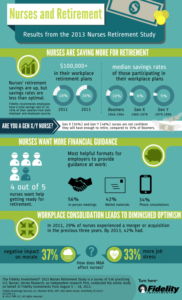
How to Make Spectacular Infographics
 This week, after nine months of intensive study and practice, we published our Summer 2014 Newsletter with a feature article on How to Make Spectacular Infographics. It offers tips and tricks and some how-to insights. It is based on a company-wide internal initiative launched last fall to develop an infographic summary of research findings for every project we do.
What kinds of tips and tricks and how-to insights? Stuff like this:
1. Use a professional tool (and we tell you which one)
2. Keep it short (and we tell you how short)
3. Make it something to explore (and we tell you how)
4. Tell a story (because data never speaks for itself)
5. Think in blocks (and shuffle them around)
6. Use text as graphics (to avoid over-using icons)
7. Repeat visual elements, but break it up (to build cohesion)
8. Remember it’s a marketing tool (not a research report)
We’ve become believers in how effectively infographics can help you and us “sell” our research to the audiences and clients who benefit most from them. Infographics help us ensure that our many months of painstaking research and analysis really pay off!


