Two Pie Charts that Work Beautifully (and Four Reasons Why)
Like most researchers who take data visualization seriously, I am not a fan of pie charts. But yesterday I came across a pair of pie charts that display data in a striking and visually compelling way. Indeed, they tell a story with data better than other alternative types of charts.

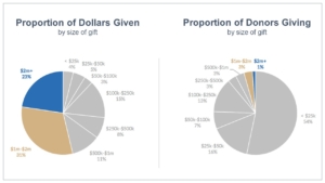
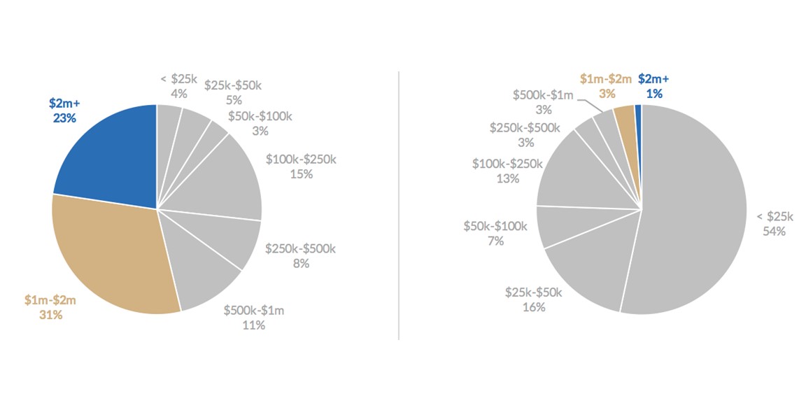
The story here is obvious, and our brains grasp it immediately: Out of everyone giving a donation, just 4% of them gave over half the money.
Why do these charts work so well? For these four reasons:
- The key comparison is between the two charts (the size of the colored areas) and the comparison is easy to see
- Within each pie chart, the parts-to-whole story is easy to grasp, with the left chart clearly showing “more than half” and the right chart clearly showing “tiny proportion of the whole”
- The chart areas that are not central to the story are shown in monotone gray, which helps us grasp the important part of the story (in color) and visually compare surface areas
- The labels offer unobtrusive details — I don’t have to study them to grasp the story, but I can review them more closely if I want
These charts come courtesy of Jonathan Schwabish, a senior fellow at The Urban Institute. If you are curious, he offers a few alternative visualizations that he experimented with for this data. I think you will agree these pie charts are best.
This doesn’t mean throw open the door and start using lots of pie charts! Usually pie charts are a terrible idea, and for good reasons. But it does mean that thoughtful attention to design, data, and stories will sometimes lead to a pie chart, and sometimes they work beautifully.
—Joe Hopper, Ph.D.
OTHER ARTICLES ON THIS TOPIC:
Why You Should Avoid Pie Charts
Visualizing Data: Six Hints On Using a Pie Chart


